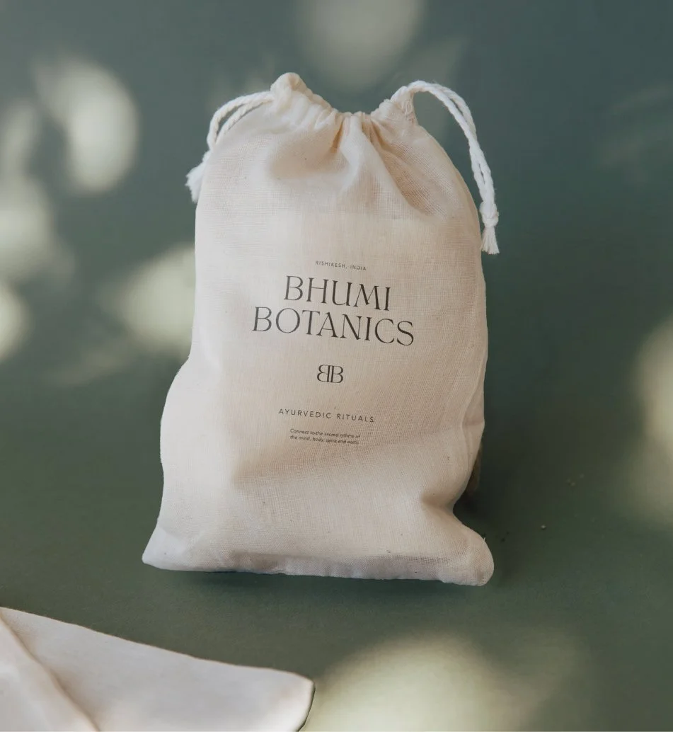
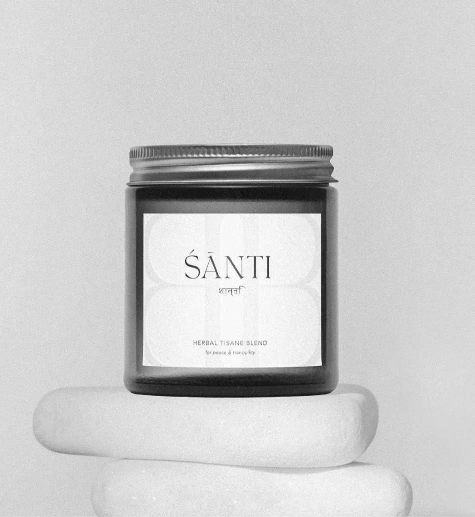
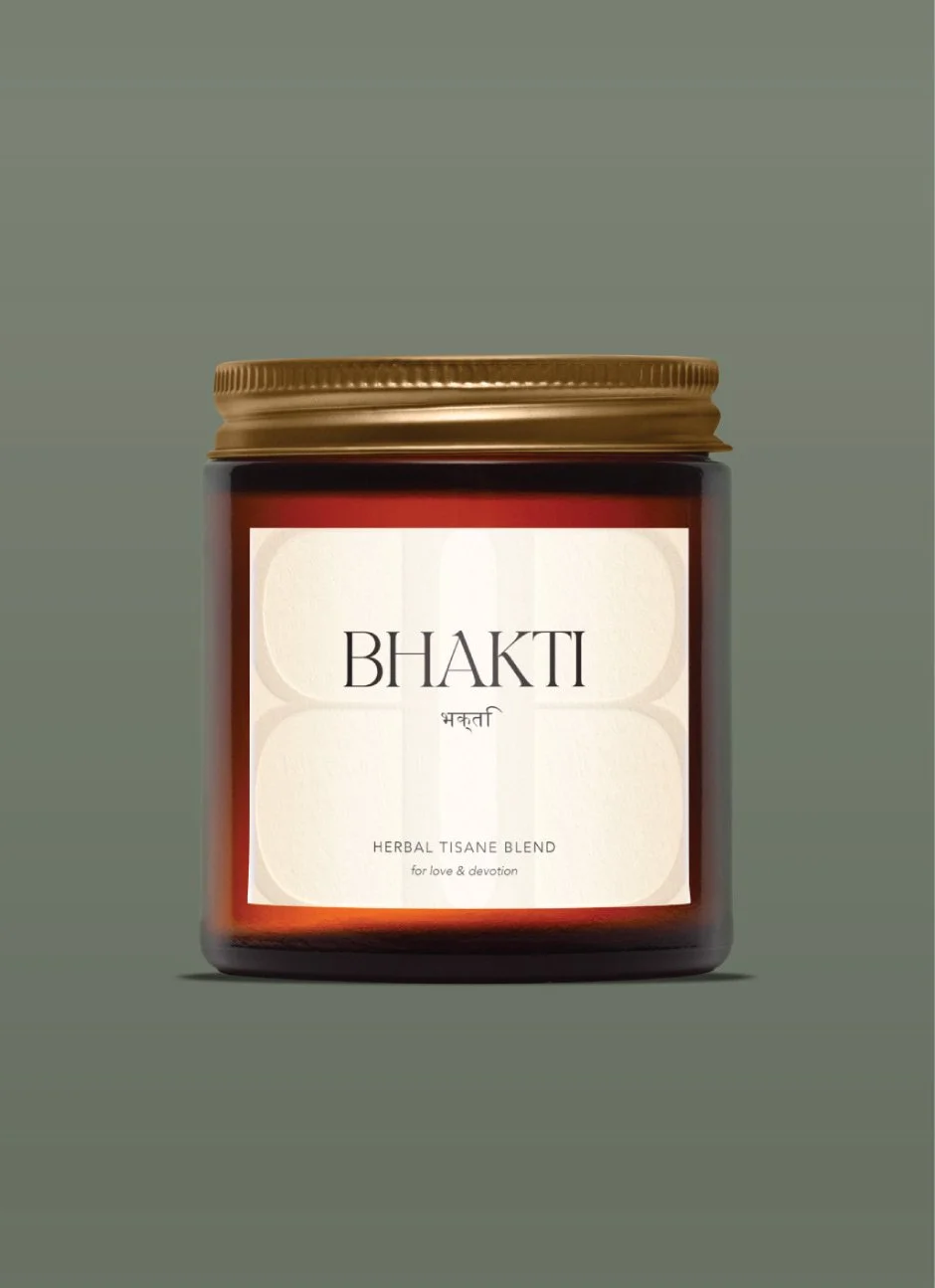
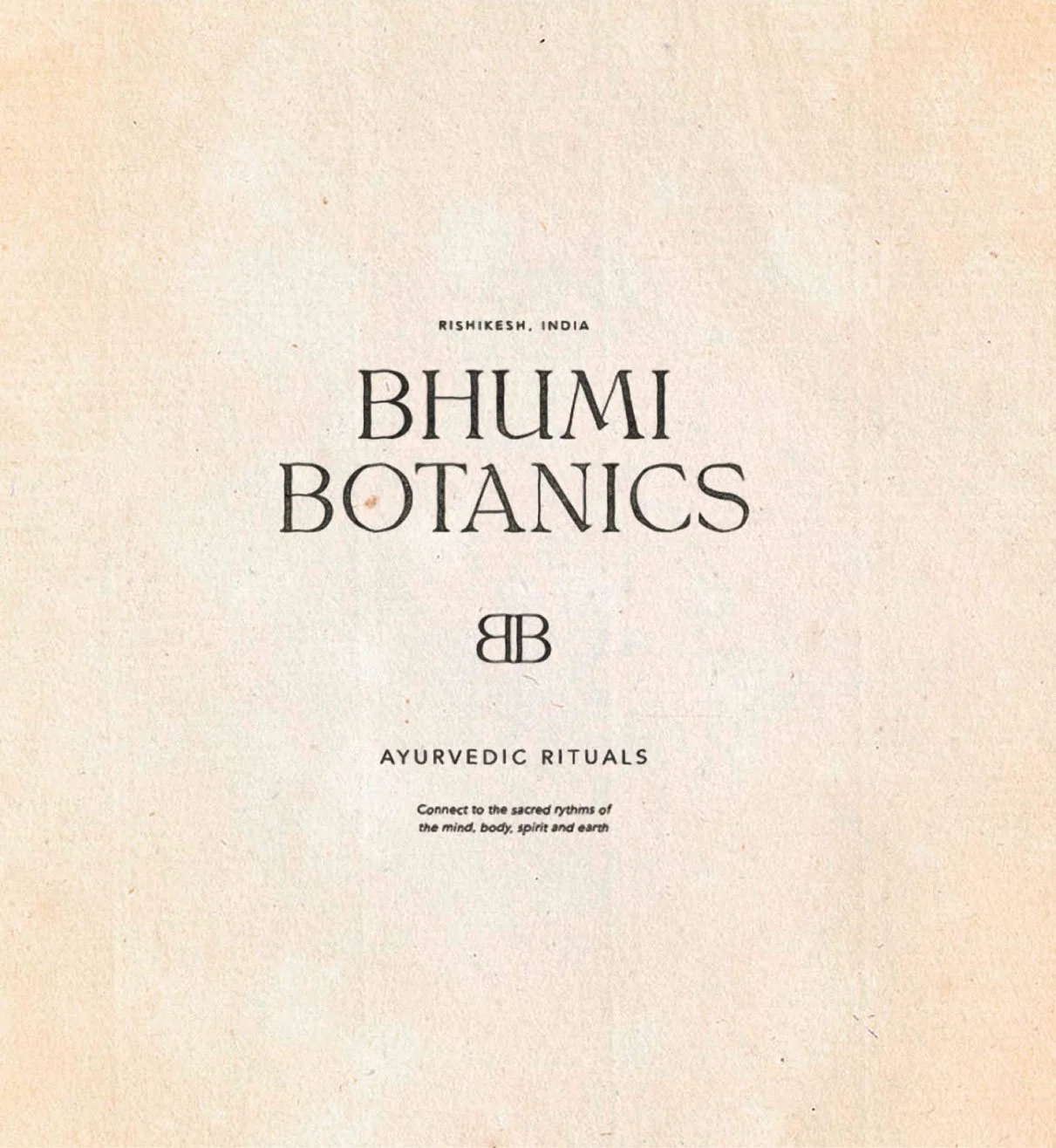
• BHUMI BOTANICS •
Prestesse is a conscious clothing brand redefining the meaning of luxury fashion - not as fleeting trends, but as a sacred reconnection with self. Guided by the ethos of ‘Wildness is the New Wellness’, each piece is designed to feel like a second skin, honouring the body and awakening the soft power of the sacred feminine.
BRAND IDENTITY
PACKAGING DESIGN

Behind the Brand
Coralie came to Crafted Wild with a vision: to create a brand where clothing is more than a garment - it is a ritual, an intimate, sensory experience, and an extension of who we are. Each piece is made from non-toxic, natural materials that nurture the body like a second skin.
Our goal was to create a brand identity that felt distinct in the fashion industry. One that subtly expressed the theme of the wild feminine, without feeling cliche. Something that danced gracefully between powerful and delicate, and conveyed the raw organic nature of the brand, whilst still feeling refined.
• THE CREATIVE APPROACH •
We intentionally stepped away from the typical fashion branding of minimal type and a stark white palette, and instead shaped a visual world that felt warm, sensual and artistic.
For the logo, we paired a bold, organic wordmark with a delicate illustration and accent fonts, capturing the interplay of softness and strength. The hand drawn illustration of a cheetah was inspired by ancient Egyptian art - a culture known to be deeply connected to the sacred feminine - embodying both a wildness and grace.

We crafted a modern type system that juxtaposes a bold sans-serif with a thin classic serif to create a look that feels both powerful and refined. A hand-drawn accent font was layered in minimally, adding a final touch of wild elegance.
We also created a stand alone sub-mark, weaving together the three S’s of Prestesse into an icon that feels fluid and elegant.
"Kat created an incredible brand identity that surpassed all my expectations. It looks even better than I had imagined it in my minds eye!
Every single detail from the logo to the colours, fonts and overall style was so thoughtfully designed. Throughout the process there was always room for discussion and clarification. Communication was seamless and Kat’s quick responsiveness and professionalism made the collaboration super easy and an absolute pleasure.”