• PRESTESSE •
Prestesse is a conscious clothing brand redefining the meaning of luxury fashion - not as fleeting trends, but as a sacred reconnection with self. Guided by the ethos of ‘Wildness is the New Wellness’, each piece is designed to feel like a second skin, honouring the body and awakening the soft power of the sacred feminine.
BRAND IDENTITY
PRESTESSE.CO


Behind the Brand


Coralie came to Crafted Wild with a vision: to create a brand where clothing is more than a garment - it is a ritual, a return to self, and an extension of who we are. Each piece is made from non-toxic, natural materials that nurture the body like a second skin.
Our goal was to create a brand identity that felt distinct from the rest of the fashion industry. One that subtly expressed the sacred wild feminine, without feeling cliche. Something that danced gracefully between powerful and delicate, and conveyed the raw organic nature of the brand, whilst still feeling refined.
• THE CREATIVE APPROACH •
We intentionally stepped away from the typical fashion branding of plain fonts and stark white palette, and instead shaped a visual world that felt warm, sensual and artistic.

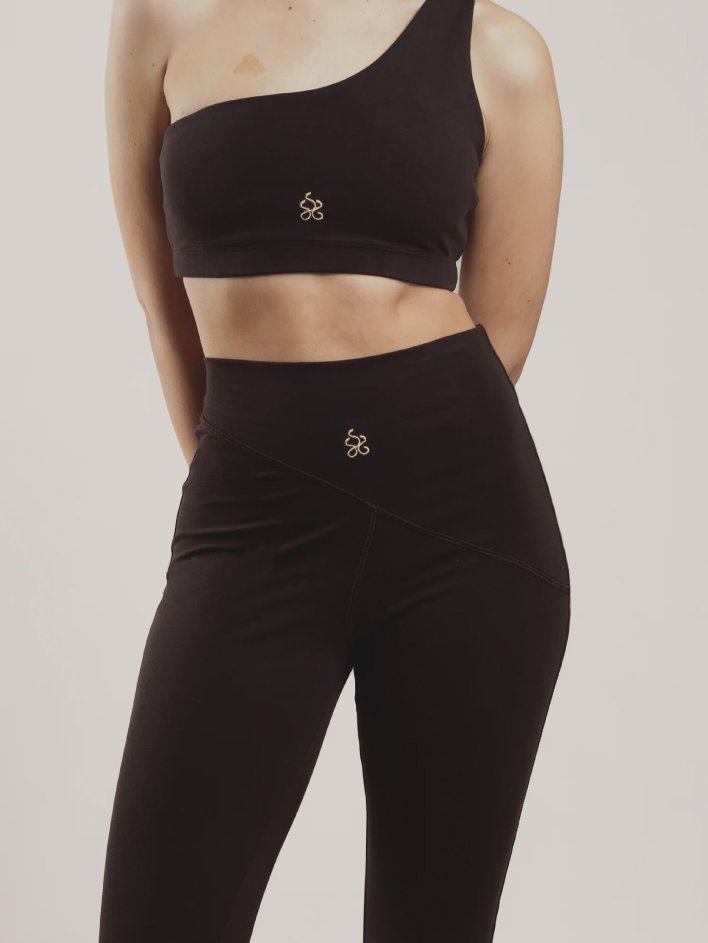
For the logo, we paired a bold, organic wordmark with a more delicate illustration and accent fonts, capturing the interplay or softness and strength. The hand drawn illustration of a cheetah was inspired by ancient Egyptian art - a culture known to be deeply connected to the sacred feminine - conveying both wildness and grace.


We crafted a modern type system that juxtaposes a bold sans-serif with a thin classic serif to create a look that feels both powerful and refined. A hand-drawn accent font was layered in minimally, adding a final touch of wild elegance.
We also created a stand alone sub-mark, weaving together the three S’s of Prestesse into an icon that felt fluid, elegant and feminine.


“Before working together, Prestesse was still at an early and sensitive stage. I had the vision, values and energy in mind, but I needed clarity and coherence in the visual identity.
Throughout the entire process I felt truly heard and supported. Kat didn’t just create a logo - she translated the emotional and energetic identity of Prestesse with such sensitivity and precision, into a visual world that feels alive and aligned with the soul of the brand.
Since working together Prestesse has launched its first drop and is steadily growing with an aligned community and meaningful collaborations.”